Pantone 2026 Color “Cloud Dancer” & the Future of Brand Identity
- Dec 10, 2025
- 2 min read
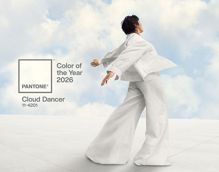
Every December, the global design world watches as Pantone announces its Color of the Year — a symbolic hue intended to reflect cultural currents and shape design trends for the year ahead. This time around, Pantone shocked many by selecting Cloud Dancer (PANTONE 11-4201) — a soft, airy white. Cloud Dancer represents serenity, clarity, and a fresh start.
For brands, this isn’t just design news — it’s a powerful signal. As a “blank-canvas” shade, Cloud Dancer invites a reevaluation of brand identity, visual language, and creative strategy. It’s a reminder that sometimes, simplicity speaks louder than noise — and that brand positioning thrives when identity is clear, focused, and intentional.

Why Cloud Dancer Matters to Branding in 2026
A Return to Clarity & Minimalism
Cloud Dancer’s soft white tone reflects a broader cultural shift: in a world saturated with fast content and visual clutter, consumers are gravitating toward calm, clean aesthetics. For brands, adopting this trend means leaning into design that feels timeless, cohesive, and adaptable across platforms — from packaging and websites to social feeds and print collateral.
A Flexible “Blank Canvas” for Versatile Branding
White as a base hue offers unmatched versatility. It allows brands to layer bold logos, striking typography, rich product photography, or vibrant accent colors — while keeping the overall design grounded and cohesive. For new launches or rebrands, Cloud Dancer offers a neutral foundation that enhances readability, photo quality, and perceived quality.
Reinforcing Brand Identity Through Consistency
In branding, consistency builds recognition. When every piece of your identity — from packaging and logo to social content and presentation decks — uses unified design language, the brand becomes instantly recognizable. Cloud Dancer offers a universal base that supports that cohesion, helping strengthen brand recall and trust.
How Italia Designs Interprets Cloud Dancer for Clients
At Italia Designs, we view colors not just as aesthetics — but as strategic tools. Cloud Dancer’s neutrality and clarity align perfectly with our philosophy of thoughtful brand development, clean branding design, and intentional marketing strategy.
When we work with clients on packaging, logo design, web design, or presentation design, we can use this hue to:
Build elegant, airy visual systems that highlight product and message without distraction
Craft custom packaging and mailers that stand out as refined and modern
Create presentation decks and digital assets with clarity and readability at their core
Maintain brand cohesion across all channels — digital and print — for lasting identity strength
Embrace the “Blank Canvas” with Strategic Design
Whether you’re launching a new product, refreshing your brand identity, or crafting digital marketing campaigns, now is the perfect time to consider what underlying tones represent your message. Cloud Dancer isn’t a call for neutrality — it’s an invitation for clarity.
At Italia Designs, we help brands interpret trends like this through the lens of strategy. From brand audits and brand guidelines to packaging, content, and digital marketing services, we build identities that feel intentional, aligned, and future-proof.
<< Ready to redefine your brand identity with a tone that resonates today? Contact us for a complimentary consultation and let’s shape your visual voice for 2026 and beyond. >>
📞 (631) 445-3675


